MiMedia
Where digital gets personal: MiMedia needed their application to break digital media free and let it integrate seamlessly with users' lives, creating an emotional experience to be shared with loved ones.
- MiMedia
- Branding, UX, Design
- Ronik
The Challenge
With their in-house team tied up with the app's beta launch, MiMedia needed a partner to create a site targeting their new audience. The new site would need to communicate what MiMedia is and how it'll solve a customer's digital problems. Ronik teamed with MiMedia over several years to strategize, design, and develop their digital product and its marketing site.
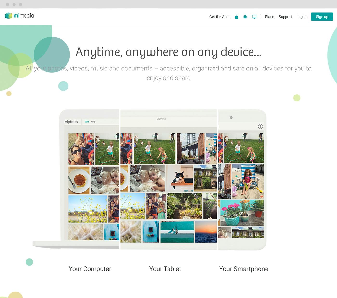
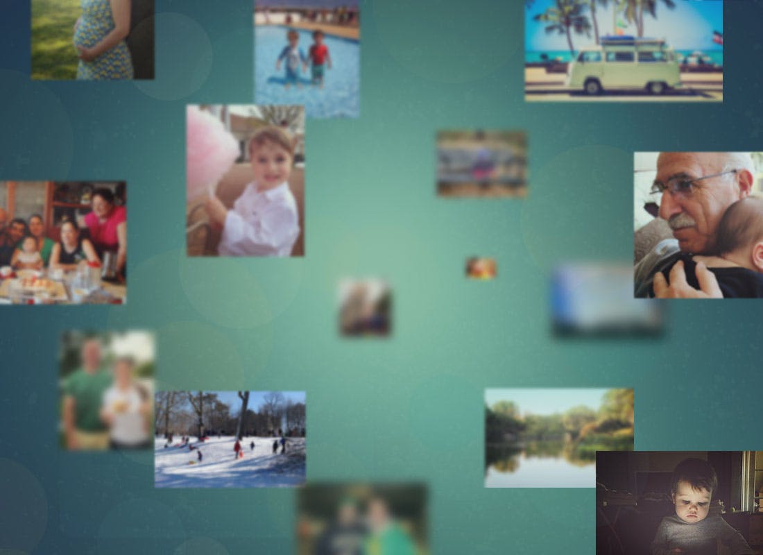
These days, everybody's a media creator. A typical person is capable of creating and consuming thousands of pictures, videos, documents, and music files in a month. MiMedia wanted a way for people to organize and enjoy all of their media in one place--from the moment of a song's creation to the rediscovery of a childhood photo.
MiMedia also needed to articulate the app's features and utility in a quick, easy, fun way. The first launch would be targeted to millennials' parents--those looking to reconnect with their memories and may need assistance organizing and playing. The language and visuals would need to speak to them.
The Marketing Site
To connect with our target audience, we decided to tell the story of a moment. This moment included the history of the event, the photo capturing the event, and the time when it was rediscovered in the MiMedia drive. The journey is full of callouts which highlight product features and communicate how the app will integrate into a customer's life.
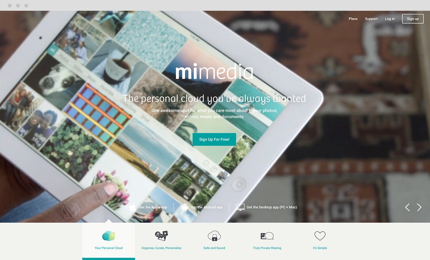
To achieve this narrative, Ronik created a full set of html5 interactive pieces accompanied by motion graphics which communicate the service's freshness and ease-of-use. Being an SaaS product that had to be able to be used across diverse devices, it was especially imperative that MiMedia functioned well as a mobile solution. This included identifying the key points of the story in the design process and how we would adapt them for portable use.
The App
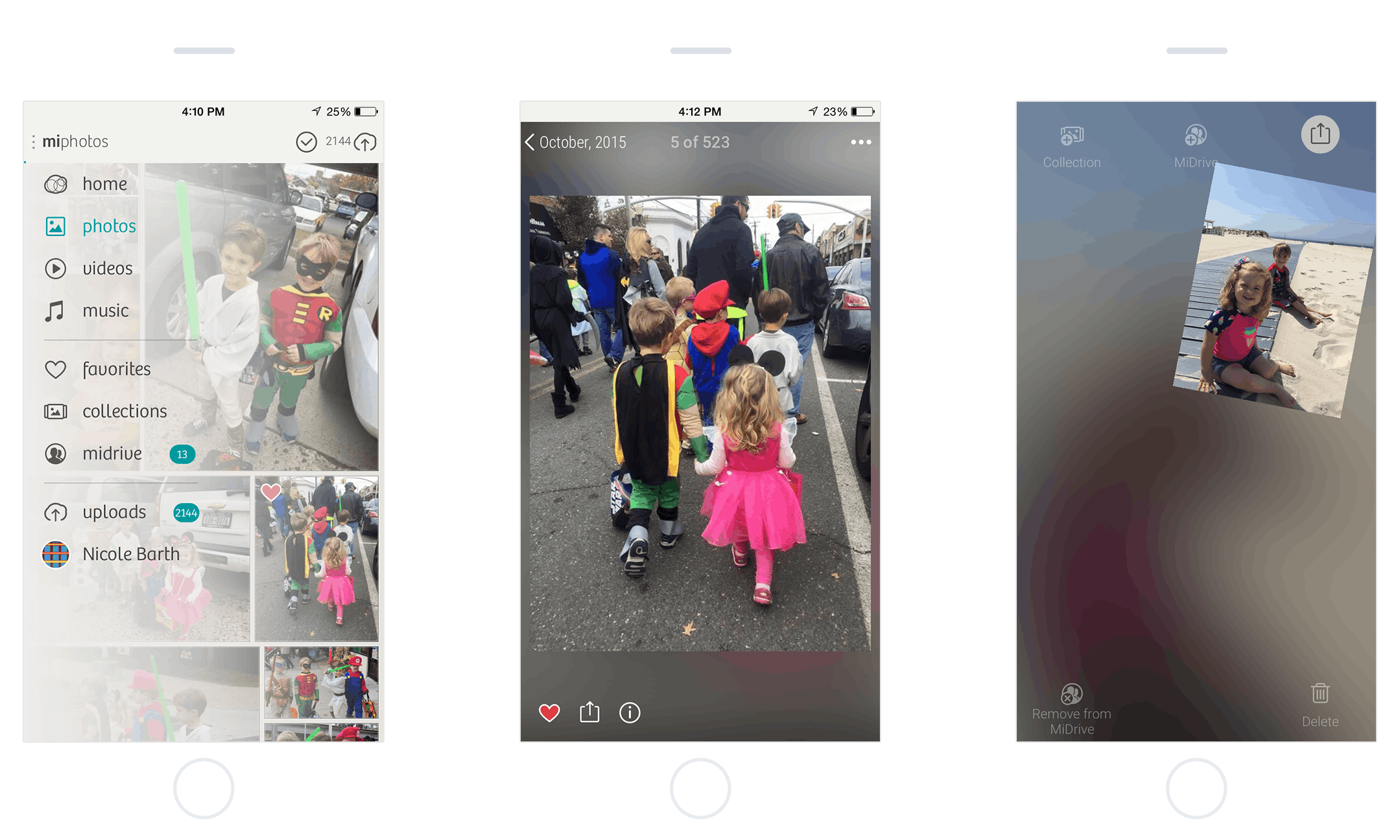
The app itself was designed with simplicity and organization in mind. I was involved in developing a consistent user experience in the app across platforms. We used MiMedia's knowledge base and our own research to develop clean user flows that let MiMedia's interface get out of the way while enabling the user to traverse and use the site's features quickly and efficiently.
The Results
MiMedia's new marketing site represented a firm stepping stone in their product's evolution, and our work served as the building blocks for the continuing iterations on their product. MiMedia is used by thousands of users to store, share and interact with their digital content.

