Luxesource
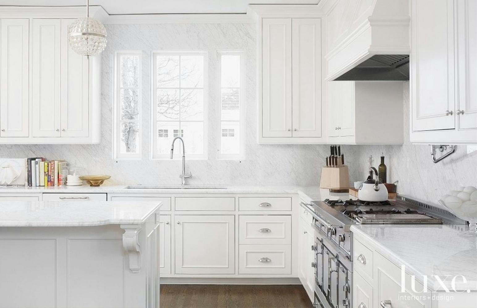
I helped create a brand new online experience for Luxe Magazine: a powerful web app showcasing thousands of stunning architecture and design images.
- Sandow
- Research, UX, Branding, Design, Development
- Ronik
The Challenge
Luxe Interiors + Design Magazine is a luxury publication aimed at affluent homeowners. The magazine is a highly curated design inspiration resource and guide to the latest trends in interior decoration and architecture. LuxeSource, its companion website, similarly offers a catalogue of design images for inspiration, as well as local directories for talented designers, architects, and contractors.
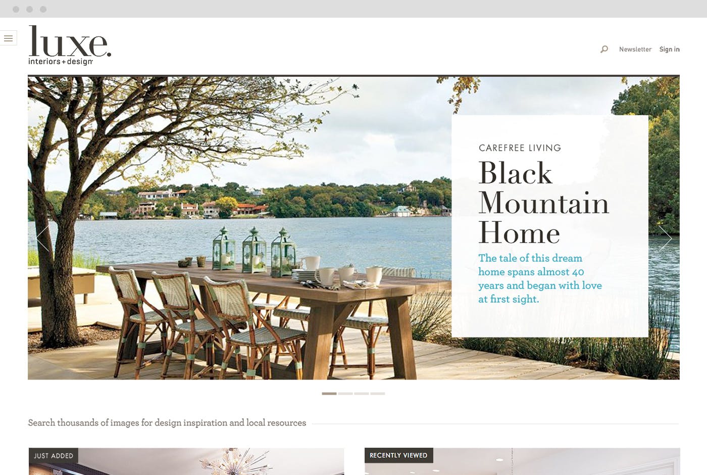
Though LuxeSource boasted a deep catalogue of high quality design photography, it lagged behind the competition in its design and functionality. The website was not consistent with the Luxe brand; the beauty and style of the elegant print publication needed to be felt online. Luxe's primary advantages — exquisite photography and talented partners — were not being properly leveraged. While the images were accessible, filtering was superficial and search functionality was non-existent. It was clear that Luxe needed an overhaul.
The Process
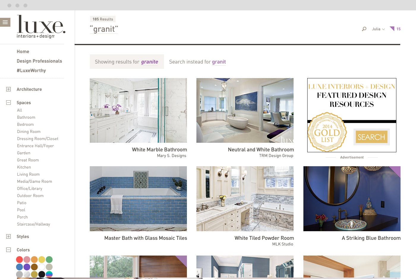
Ronik was approached to solve these problems, and we were eager to improve Luxe's formidable online offering. Our re-imagining of the LuxeSource experience was centered around utility. Their impressive database of images and information necessitated advanced search functionality, capable of quickly delivering relevant, useful results to their visitors. When considering the user experience of the site, we focused on empowering the visitor to intuitively search and discover.
The Result
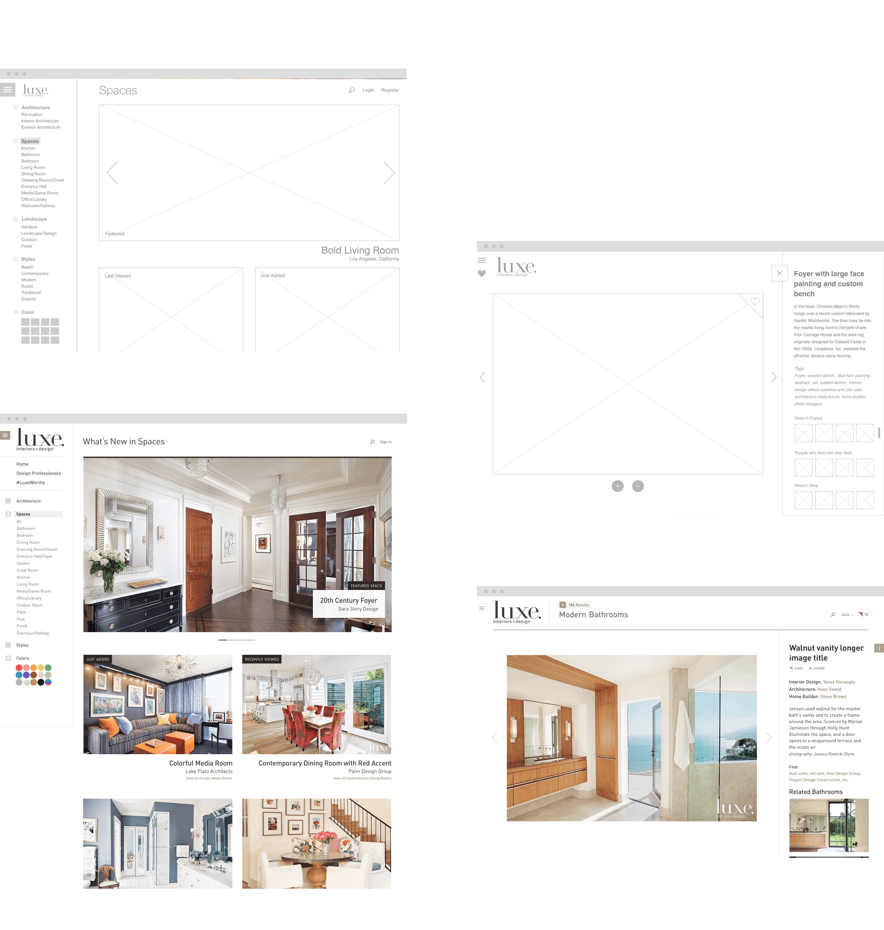
The website's functionality now complements its assets: each design is tagged and indexed so that a user can quickly use filters and search queries to create detailed, personal searches. Never before has a visitor to LuxeSource been able to browse and search the immense library of designs in such a customized way.
The new LuxeSource showcases its rich library of design imagery. The site's design is clean and modern, inheriting details and design cues from the printed magazine. The fluid site adapts to the visitor's browser, and smooth animations and transitions complete an experience designed to create a seamless high-resolution experience at any size.
The new LuxeSource experience carries the ease, beauty and simple pleasure of flipping through the magazine into an online space, and affords the LuxeSource user more power and control over their design searches than ever before. Future updates will allow users to save their favorite designs, explore the resources and products behind them through interviews and videos, and continue to offer singular design inspiration.

